THE SHORT ANSWER
A medspa site earns the booking by staying out of its own way.
Cyra Beauty needed a premium medspa experience that balanced three things most aesthetics sites treat as trade-offs: clinical credibility, calm aesthetics, and fast booking. The move that made it work was refusing to pick. The brand reads editorial and unhurried, the clinical proof is softened into the design instead of shouted, and the Jane App booking sits one click away from wherever the visitor is standing.
That is the whole thesis of the build — and it is measurable. After the June 2026 rebuild, organic impressions rose 73% per day and organic clicks 39% per day in Google Search Console, comparing May 1–Jun 13 against Jun 19–Jul 17, 2026. The full numbers are below. You can see the full Cyra Beauty case study at cyra beauty medical aesthetics, and the vertical framing lives on our medspa and aesthetic clinics page. Below is the operator's version: what actually went into the build, why, and what it measured.
THE STARTING PROBLEM
The category shouts. The buyer wants calm.
Aesthetic medicine sits in a loud corner of the internet. Discount banners, before/after overload, and urgency language are the category default — and they undercut the exact thing a physician-guided clinic is selling, which is judgment you can trust with your face. Cyra's problem was that looking like everyone else would make a serious clinical offer read as a promotion. The site had to signal restraint and competence at the same time, without burying the one action that pays for the whole site: booking an appointment.
- Physician-guided offer
- Loud, discount-led category
- Trust before the booking
- Booking must stay fast
THE MOVES
Four decisions that kept booking one click away.
Once the goal is clear — calm brand, credible clinic, frictionless booking — the build follows. These are the four moves that carried it, each with the reasoning a founder can reuse on their own site.
Jane App booking, always one click away
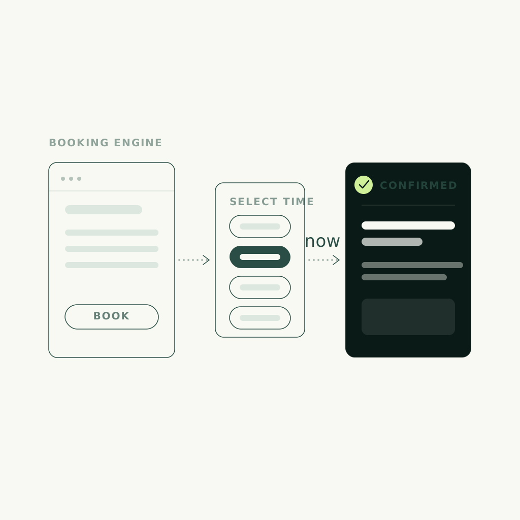
The single most important decision was to treat booking as the spine of the experience, not a page you navigate to. Cyra runs on Jane App, so the build wires that booking path to stay one click from wherever the visitor is — service galleries, FAQs, the hero. In a medspa, the visit-to-booking window is short and emotional; every extra click between interest and a confirmed time is a booking that quietly evaporates. Make the action ambient and you stop losing people to friction they never should have met.
Calm tone in a category that shouts
The tone was deliberately held quiet where the category defaults to loud. Editorial beauty styling, generous space, and restrained type do more for a physician-guided clinic than a wall of promotions ever could — because the buyer is trying to gauge judgment, and calm reads as competence. Restraint here is not a style preference; it is the trust argument. A serious clinical offer wrapped in discount energy tells the visitor the wrong thing before they read a word.
Clinical proof softened into the brand
Credibility had to arrive without turning the site into a medical brochure. So the clinical proof is softened into the brand rather than stacked as a credentials wall — present enough to reassure, quiet enough to keep the premium feel. The reasoning: a medspa buyer needs to believe the clinic is safe and expert, but they are also choosing an experience. Proof that reads as warm confidence converts better than proof that reads as a disclaimer.
Service discovery made visual
Injectables, lasers, and IV are hard to shop from a text menu, so service discovery was made visual — galleries that let a visitor understand each treatment before they commit to booking one. Expandable FAQs handle the follow-up questions inline, without the category flash. The move answers the real objection a first-time medspa visitor carries: not price, but uncertainty about what a treatment is and whether it is for them. Answer that visually and the booking click stops feeling like a leap.
THE RECEIPTS
What the rebuild measured.
Every number here is measured and dated, from Google Search Console: daily organic impressions and clicks compared across a before window of May 1–Jun 13, 2026 and an after window of Jun 19–Jul 17, 2026, following the June rebuild. Keyword positions and AI-answer citations were tracked over the same period — 10 of 11 tracked money keywords improved, with "medical spa coquitlam" moving from unranked to #2, and AI answers citing cyrabeauty.ca went from 1 to 8 of 14 tracked prompts.
STEAL THIS
What any clinic can take from this build.
You do not need to be a medspa to reuse the reasoning. The Cyra build comes down to a handful of moves that travel to any high-trust, appointment-led local business — and the receipts above are Cyra's own, not a studio average: organic impressions up 73% per day and 10 of 11 tracked money keywords improved after the June 2026 rebuild, measured in Google Search Console. Use the checklist below to pressure-test your own site, then let a Brand Score read your brand, conversion, and capture wiring in one pass.
- Wire your booking tool so the action is one click from anywhere, not a destination page
- Match your tone to the buyer's state of mind — calm sells judgment better than urgency
- Soften proof into the brand instead of stacking a credentials wall
- Make discovery visual for anything hard to shop from a text menu
- Answer the real objection — uncertainty, not price — before the booking click
FAQ
Common questions.
What matters most on a medspa website?
Keeping booking frictionless while the brand earns trust. In aesthetics the window between interest and action is short, so the booking tool — Jane App on the Cyra build — should stay one click away from anywhere on the site. Everything else, from calm styling to visual service galleries, exists to move a visitor toward that click without making the clinic look like a promotion.
Should a medspa site look loud and promotional like competitors?
Usually the opposite. The category defaults to discount banners and urgency, but a physician-guided clinic is selling judgment you can trust — and calm, editorial styling reads as competence where loud reads as a sale. On Cyra Beauty we held the tone quiet on purpose, because restraint was the trust argument, not just an aesthetic choice.
How do you show clinical credibility without a medical-brochure feel?
Soften the proof into the brand instead of stacking it as a credentials wall. The clinical reassurance is present enough to build confidence but quiet enough to keep the premium, editorial feel. A medspa buyer is choosing both safety and an experience, so proof that reads as warm confidence converts better than proof that reads like a disclaimer.
What is the biggest booking killer on aesthetics sites?
Distance between interest and action. Every extra click, form field, or page between a visitor and a confirmed appointment is a booking that quietly evaporates. The fix on Cyra was to treat booking as ambient — one click from the hero, the service galleries, and the FAQs — so intent never has to survive a navigation maze to become an appointment.
Does this only work for medspas?
No. The reasoning travels to any high-trust, appointment-led local business: keep the booking action one click away, match your tone to the buyer's state of mind, soften proof into the brand, and make anything hard to shop visual. The Cyra build is a medspa example of a pattern that applies to clinics, studios, and service businesses generally.