THE SHORT ANSWER
Luxury is what you leave out.
Vancouver Elites needed a premium real estate experience that made presale discovery feel curated rather than commodity. The move that carried the build was restraint: gold accents used sparingly, a luxury visual system that frames the property instead of competing with it, and an inquiry path that stays persistent without shouting. In a category where most brokerage sites feel like a search portal with a logo, the differentiator was making browsing feel like an editorial experience for serious buyers.
This is a decision-and-craft case study — the moves and the reasoning, not a metrics reveal. You can see the full Vancouver Elites case study at vancouver elites real estate, and the vertical framing lives on our real estate developers page. Below is the operator's version of the build.
THE STARTING PROBLEM
Every brokerage site looks like a search portal.
Real estate is a commodity-feeling category online. Most sites are an IDX search box, a grid of listings, and a headshot — functional, forgettable, and interchangeable. For a luxury brokerage, looking like everyone else is a positioning failure: a serious buyer choosing where to spend seven figures reads a generic search portal as a generic broker. Vancouver Elites needed the opposite signal. Presale discovery had to feel curated and premium, so the brand read as elevated the moment a buyer landed — without the listings themselves getting buried under decoration.
- Commodity-feeling category
- Serious, high-value buyers
- Premium brand signal
- Property must stay central
THE MOVES
Four decisions that made browsing feel premium.
Once the goal is a curated experience for serious buyers, the build follows. These four moves carried it, each with the operator reasoning a founder can reuse.
Gold accents, used sparingly
The luxury signal came from restraint, not saturation. Gold accents are used sparingly so the brand reads premium without crowding the property experience. The reasoning is counterintuitive but reliable: in luxury, more decoration reads as less premium. A single, well-placed accent against generous space signals confidence, while gold everywhere signals a brand trying too hard. Restraint is the flex — it lets the property, not the palette, be the thing the buyer remembers.
A luxury visual system that frames the property
The visual system was built to frame listings rather than compete with them. Premium type, calm layout, and disciplined spacing put the property at the center of attention, because in real estate the listing is the product — the brand's job is to make it look its best, not to upstage it. A system that draws the eye to itself is a system working against the sale. The elevated feel comes from how the property is presented, not from ornament layered on top.
IDX search and a presale carousel
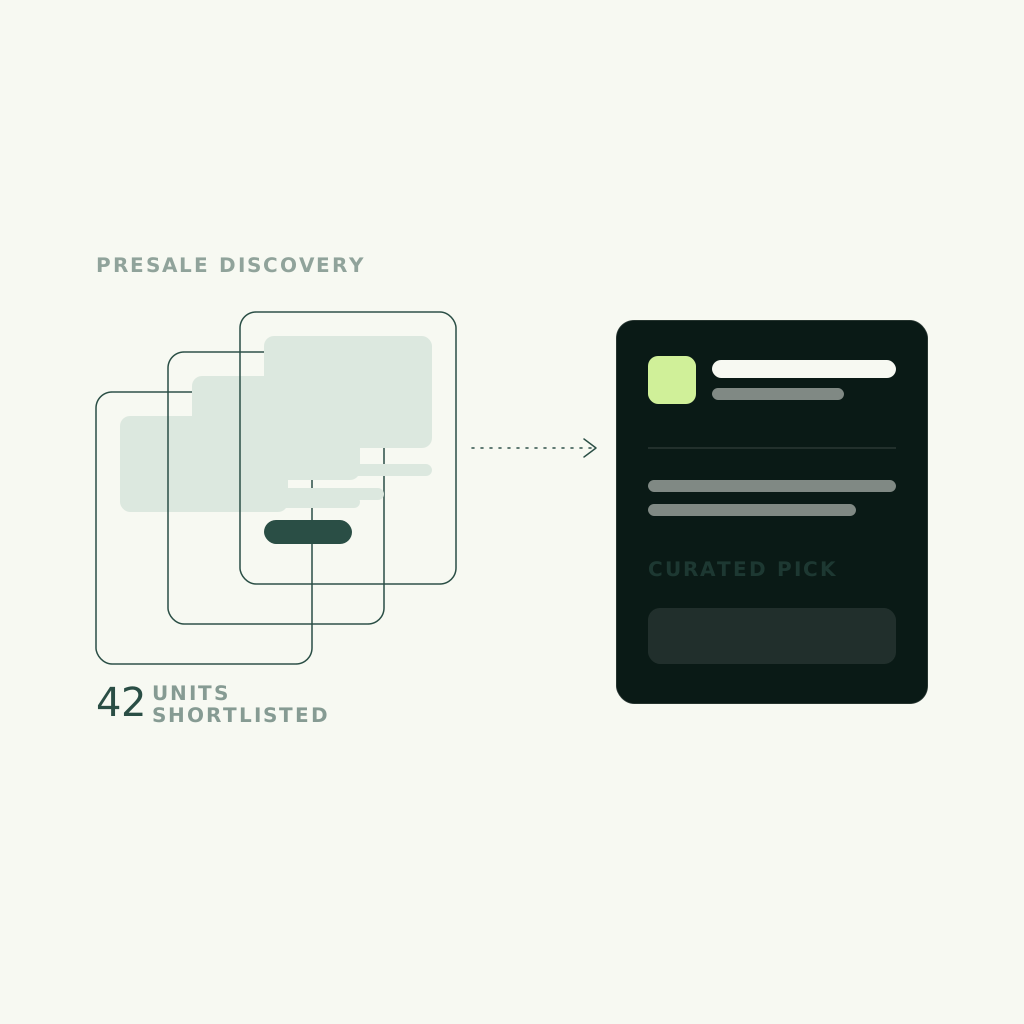
Discovery was built around IDX search and a presale carousel, so the two things a luxury buyer wants — the ability to search real inventory and a curated look at what is coming — both live in the premium frame. The presale carousel is the curation move: instead of dropping the buyer into an undifferentiated grid, it presents a considered selection first, which is exactly what makes discovery feel editorial rather than commodity. Search handles intent; the carousel sets the tone.
A persistent inquiry path
The inquiry path was made persistent so a buyer can reach out from wherever interest strikes, without hunting for a contact form. The reasoning: luxury buying is non-linear — a serious buyer might decide to inquire on a presale card, a listing detail, or the brand story, and the site should never make that impulse wait. Persistent, low-pressure inquiry keeps the conversion handle in reach across the whole journey, which matters more when the browsing session is long and considered.
STEAL THIS
What any premium brand can take from this build.
The Vancouver Elites playbook travels to any premium, high-consideration category. The core lesson: in luxury, restraint is the differentiator, and the product — not the brand's decoration — should hold the spotlight. The Vancouver Elites build was engineered conversion-first underneath that restraint. Use the checklist to pressure-test your own site, then let a Brand Score read your brand, conversion, and capture wiring in one pass.
- Use your accent color sparingly — in luxury, restraint reads as confidence
- Build the visual system to frame the product, not to upstage it
- Lead discovery with a curated selection before an undifferentiated grid
- Keep the inquiry path persistent for long, non-linear buying journeys
- Signal premium by what you leave out, not by what you pile on
FAQ
Common questions.
What makes a luxury real estate website feel premium?
Restraint. On Vancouver Elites the premium signal came from using gold accents sparingly and letting generous space and disciplined type frame the property. In luxury, more decoration reads as less premium — a single well-placed accent signals confidence, while ornament everywhere signals a brand trying too hard. The elevated feel comes from what you leave out.
How do you make property browsing feel curated instead of commodity?
Lead with a considered selection before an undifferentiated grid. Vancouver Elites uses a presale carousel to present a curated look at what is coming, alongside IDX search for real inventory. Dropping a buyer straight into a generic search portal reads as a generic broker; opening with curation makes discovery feel editorial, which is the differentiator for serious, high-value buyers.
Should the brand or the listings be the focus?
The listings. In real estate the property is the product, so the visual system's job is to make it look its best, not to upstage it. On Vancouver Elites the luxury system frames listings rather than competing with them — a brand that draws the eye to itself is working against the sale. Premium presentation of the property is what creates the elevated feel.
Where should the inquiry path live on a brokerage site?
Everywhere the buyer might decide to act. Luxury buying is non-linear, so on Vancouver Elites the inquiry path was made persistent — a buyer can reach out from a presale card, a listing detail, or the brand story without hunting for a form. Keeping a low-pressure conversion handle in reach across a long, considered session captures interest at the moment it strikes.
Does this only apply to luxury real estate?
No. The reasoning applies to any premium, high-consideration category: use accents sparingly, build the system to frame the product not upstage it, lead with curation over a raw grid, and keep inquiry persistent. Vancouver Elites is a real estate example of a restraint-first pattern that works wherever the buyer is serious and the decision is considered.