THE SHORT ANSWER
What a pre-sale site is actually for.
A development website isn't a brochure for a finished building — it's a pre-sale machine that has to sell the idea of a home that doesn't exist yet. Its job is to convert anonymous interest into a qualified, ranked registration list the sales team can work, weeks or months before the display suite opens. That reframes every decision: the renders carry the emotional weight photography normally would, the registration form is the primary conversion, and speed-to-lead on that form decides who gets the best units. Judge the site not on how it looks, but on how many qualified registrations it captures and how fast those leads reach a human. Everything below serves that one number. For the full vertical context — positioning, proof, and pricing for developers — see real estate developers.
THE RECEIPTS
THE LIFECYCLE
One site, three phases.
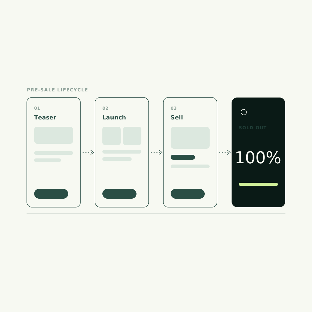
A pre-sale site isn't static — it moves through a lifecycle, and the same URL has to do a different job at each stage. Build it so the content model flips phases without a redesign, and you keep momentum instead of rebuilding at every milestone.
1. Teaser
Before pricing or floorplans exist, the site's only job is to build a registration list. Neighbourhood story, a hint of the architecture, and a single low-friction 'register your interest' form. No unit detail to leak, no price to anchor against — just capture and rank early demand so you launch to a warm list, not a cold market.
2. Launch
When pricing, floorplans, and renders go live, the site becomes a sales tool. Registered leads get first access, floorplan pages open, and the CTA shifts from 'register' to 'book a private appointment.' This is where render-first hierarchy and floorplan UX earn their keep, and where speed-to-lead decides who tours first.
3. Sold-out / final release
As inventory tightens, scarcity does the work: mark released collections sold, spotlight remaining units, and pivot the CTA to a waitlist for the next phase or building. A site built for the lifecycle rolls straight into the developer's next project instead of dying at completion.
RENDER-FIRST
The renders are the product.
There is no building to photograph, so the renders carry the entire emotional case. Treat them the way an e-commerce brand treats hero product shots — full-bleed, high-resolution, and never crushed by compression. The visual hierarchy should open on the single strongest render, then let a buyer move deliberately from lifestyle to architecture to interior to view, each earning the scroll. Vancouver Elites was built exactly on this principle: presale browsing elevated so discovery feels curated rather than commodity, with the brand credibility a luxury buyer needs before they'll register. See the build at vancouver elites real estate, or read the Vancouver Elites case study for the decision-by-decision teardown. The anti-pattern is a cramped gallery grid that treats a $2M view like a thumbnail — it reads as inventory, not as a home worth registering for.
- Open on your strongest render
- Full-bleed, never compressed
- Lifestyle, then architecture, then interior
- Curated sequence, not a grid dump
FLOORPLAN UX
Make the floorplan do the selling.
The floorplan page is where a curious browser becomes a serious buyer, so it can't be a PDF download that dead-ends the journey. Let buyers filter by what they actually shop on — bedrooms, price band, exposure, floor level — and see availability honestly. Every plan should carry its view render, its orientation, and a single obvious 'request this unit' action that hands the specific plan straight to the sales team as context. The rule: a buyer should never have to leave the site, open a PDF, and email a generic address to express interest. The moment they love a plan is the moment to capture it, with the plan attached.
Filter the way buyers shop
Bedrooms, price band, exposure, and floor level — the real decision criteria. Filtering that matches how a buyer thinks keeps them on the page instead of asking a salesperson to do the sorting.
Availability, honestly
Show what's available, held, and sold. Honest scarcity converts; a wall of identical 'inquire' buttons hides the momentum that makes a buyer act now instead of later.
One-tap unit interest
A 'request this unit' action on every plan that routes the specific floorplan to the sales team as context — no PDF, no generic inbox, no re-explaining which unit they meant.
QUALIFY THE LEAD
Not every registration is the same lead.
A development site attracts three very different people, and a form that treats them identically wastes the sales team's most valuable hours. Build the registration flow to quietly sort them, so the highest-intent buyers surface first and the sales team knows who they're calling before they dial.
The end buyer
Shopping for a home to live in — motivated by lifestyle, layout, and neighbourhood. Capture their must-haves (bedrooms, move-in timing, budget band) so the sales team opens with the right units instead of a cold pitch.
The investor
Motivated by numbers — rental yield, deposit structure, assignment terms, completion timing. A single field on intended use lets you route them to the right materials and the right conversation, not a lifestyle brochure.
The realtor
Bringing clients, and needing co-broke terms and inventory access fast. Identify them at registration so they land in the agent track — because an agent kept waiting takes their buyers to the next launch instead.
SPEED-TO-LEAD
The first developer to call usually wins.
In a hot launch, the best units go to the buyers who get reached first — so the gap between a registration hitting your site and a human following up is where deals are won or lost. A registration that sits in an inbox overnight is a buyer touring your competitor's suite tomorrow. Wire the form so it does three things the instant it's submitted: routes into the CRM with the unit or floorplan context attached, notifies the assigned salesperson in real time, and triggers an immediate confirmation to the buyer so they know they're on the list. Better still, wire an AI voice or SMS line to make first contact in minutes while the sales team works the ranked list. The prettiest development site in the city loses to a plainer one that calls back in five minutes.
- Route to CRM with unit context
- Notify the salesperson in real time
- Confirm to the buyer instantly
- First contact in minutes, not days
LUXURY RESTRAINT
Restraint is the luxury signal.
Most development sites now come off the same handful of real-estate templates, and buyers — especially at the top end — read that sameness instantly. Distinctiveness has become the scarce good: generous whitespace, a considered type system, calm motion, and photography-grade renders signal a quality of building that a busy, effect-heavy template quietly undermines. The discipline is subtraction. One confident render beats a carousel of six. A single clear CTA beats a screen of competing buttons. The site should feel like the building will feel — composed, intentional, and expensive in the way that doesn't shout. That restraint isn't decoration; it's the pre-sale argument that this is worth registering for before it exists.
- Whitespace over density
- One render over a carousel
- Calm motion, not effects
- Distinctive, not templated
FAQ
Common questions.
How do you sell real estate units that haven't been built yet?
You sell the idea, then capture and rank demand before the display suite opens. A pre-sale website builds a registration list in the teaser phase, converts it to private appointments at launch, and uses render-first storytelling to make a home buyers can't yet walk through feel real. The site's success metric is qualified registrations and speed-to-lead, not page views.
What makes a pre-sale development website different from a normal real estate site?
A normal listing site shows finished properties; a pre-sale site sells something that doesn't exist yet, so renders replace photography, the registration form is the primary conversion, and the whole thing moves through a teaser-to-launch-to-sold-out lifecycle. It's closer to an e-commerce launch than a brochure — built to capture and qualify demand ahead of inventory.
How important is speed-to-lead for a development launch?
Decisive. In a hot launch the best units go to the buyers reached first, so a registration that sits overnight is often a buyer touring a competitor the next day. Wire the form to route into the CRM with unit context, notify the salesperson instantly, and ideally trigger AI voice or SMS first contact within minutes while the team works the ranked list.
Should a development site qualify buyers, investors, and realtors differently?
Yes. The three arrive with different motivations — lifestyle for end buyers, returns for investors, co-broke access for realtors — and a form that treats them identically wastes the sales team's best hours. A registration flow that quietly sorts intended use and intent lets the highest-value leads surface first and reach the right conversation faster.
Why do so many development websites look the same?
Most are built on the same handful of real-estate templates, and buyers read that sameness as ordinary — a problem at the luxury end where distinctiveness is the point. The fix is restraint, not more effects: generous whitespace, a considered type system, and photography-grade renders that make the site feel the way the building will feel.
Can Side Studios build our development or pre-sale website?
Yes — it's a core vertical. We build render-first, capture-wired development sites that move through the full teaser-to-sold-out lifecycle, with floorplan UX and lead routing built in. Vancouver Elites is a luxury real estate build shipped on exactly these principles. Start with our developers page at real estate developers or run the Brand Score on your current site.